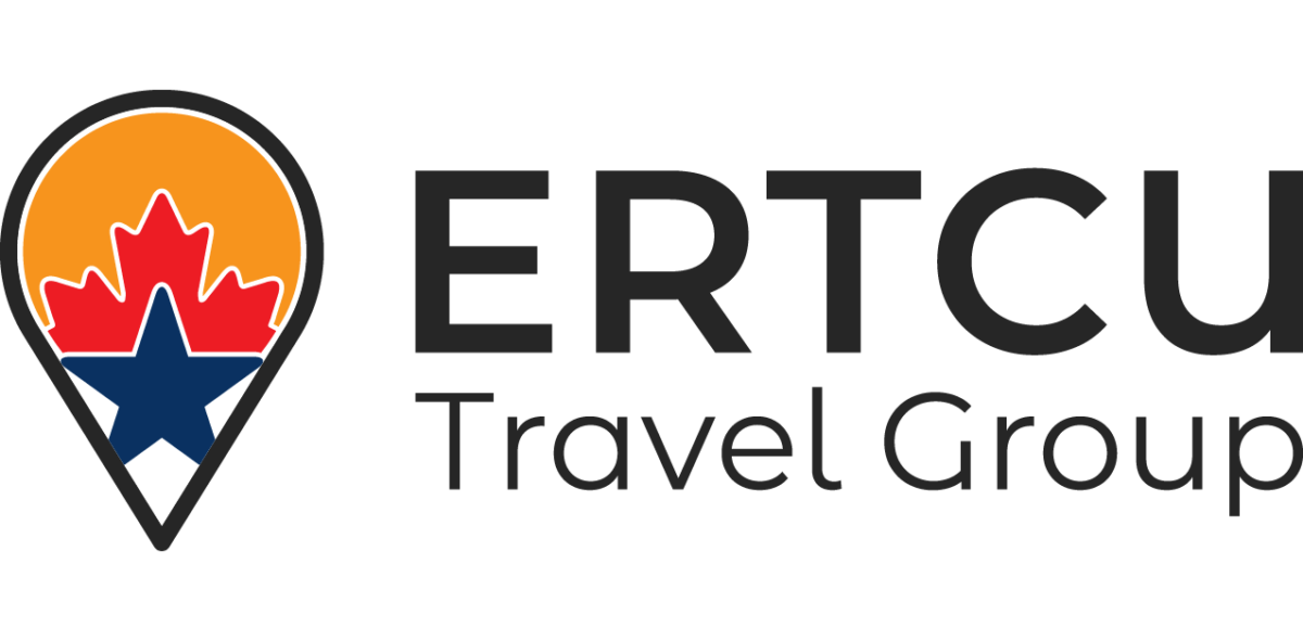
Our Logo
Since the beginning of En Route Travel until now, we have experienced consistent and incredible growth. With this growth comes the need for a fresh look, representing who we are and how our business has progressed over the years. This starts with new logos and an official tagline!
We have developed three logos that operate together, as a family. At the top, we have ERTCU Travel which is the legal and registered name that we operate under. Within this, we have two “trade” names that we do business as: En Route Travel Canada and En Route Travel USA. It is important for us that they all have their separate logos and identities, as they all serve different purposes that come together holistically as ERTCU Travel.
Just like our business style & culture, these logos are clear, concise and to the point. Shaped like the location markers we use to plan memorable routes from point A to B, they reflect our Company at its most simple form: guiding our customers through our itineraries across North America, day by day, highlight by highlight. Essentially, these markers are used to build the itineraries that make up our business and provide customers with hassle free, convenient RV travel that has been pre-planned and covers everything from campsites, experiences, ferries, and more.
We operate in Canada and the United States, which is represented on our logos by their flags, respectively. En Route Travel Canada uses the red maple leaf to represent Canada, an internationally recognized symbol of Canadian identity. Similarly, the blue star used in En Route Travel USA’s logo is internationally recognized as a symbol of the US, and representative of their flag. Our ERTCU Travel logo includes both symbols, to represent that our overall business encompasses both these countries.
All three logos include an orange sun, representative of the joy and good times we organize for our customers. We provide positively memorable vacations for families, and tailor our routes to what activities they enjoy the most to make for an unforgettable experience! It is also representative of our founders’ Dutch heritage and culture, as the colour orange is internationally recognized as The Netherlands’ colour.
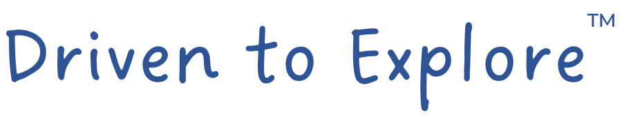
We are also proud to unveil our new tagline “Driven to Explore™”, which perfectly summarizes the essence of our business as well as the personal lives of our team. All ERTCU team members have immigrated from Europe to North America and have intensively explored this beautiful part of the world. We are motivated, or “driven”, to continue exploring these beautiful countries so that our customers can experience what we love so much about North America. With Canada and the US being such vast countries, we use our knowledge of North America to help tourists navigate their desired destinations. “Driven to Explore™” also emphasizes the beauty of RV Travel, and the advantages of being able to bring your home with you as you drive through our routes and explore what the area has to offer.